Showing posts with label contrast. Show all posts

Friday, 30 November 2012

Another Quicky

I'm coming to the end of the Photojournalist project I've been working on so starting to edit my final images. Admittedly I still have one shoot I need to do but that's all planned.

I showed you one edit yesterday, of the sign. Today I have some trees for you.

The original.

The edited version.

I've made the crop much tighter on this image as I think it looks quite sparce in the frame otherwise and I've given the reds a push to make the leaves more vibrant. I much prefer the second version of the image. 

This afternoon I'm off to the University's annual Tea Dance, photographing for Space again. I'm really rather excited. 


Wednesday, 28 November 2012

Only A Little Edit

I'm taking a break from doing my essay. I think I deserve it, I've written a full 88 words so far... yeah that's how long the title is. I hate essays. However after this post I am going to try my very bestest to do it.

First though, I've had a little play with Photoshop. Only a tiny tiny play with photoshop because I don't actually like photoshop (yes it was a distraction).

The original

The edited version

What do you think? I think I prefer the edited version but I'm not sure... The only real difference is a bit of desaturation in the grass, a small pushing of the blacks in levels and the tiniest of crops.


Sunday, 25 November 2012

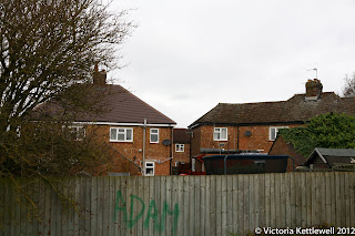
Hesters Way, Take Two/Three

Do you remember my first shoot at Hesters Way? The one that went a bit wrong and was really rubbish? No, well you should see it here. I've been back twice since then, one of those times I didn't have my laptop so you'll just have to have two updates at once about this project.

#1


The depth of field on this image makes the patch of grass in the background seem very large and empty.

Slightly underexposed but that's why I like this one as it starts to look over the estate. 

Gunna take my flashgun back with me to get this shot again, make the colours "pop".

If I slightly crop in to this shot I think it will be better as I'll make it more symmetrical.

This photo isn't very good but I have to go back and take my flash gun with me to get a photo of the trolleys a bit closer up.

#2


You can't really see it in this photo but in the top left windows of this house there is a line of knitted dolls. I used to have a clown made just like these. 

It's wonky but I like it and with a little straightening I think it will be fine. 

I really like the way the sign stands out here without the use of flash because of the white line surrounding it.

How warm and autumny do these trees make this shot? I think the colours are lovely. 

Now I just have to find time to go back with my flashgun.. and a bodyguard.


Thursday, 18 October 2012

A Cheeky Edit

Photoshop is not my strong point and nor has it ever been. Today though I spent some time playing around on CS6. I spent most of the time stressing out because I couldn't get the image how I want it. It still isn't how I want it. However, I am still liking what I have managed to get.


As you can see, contrast has been whacked up to emphasise the shadows on the stones and some of the saturation has been taken out as well. Ideally, I'd like to be able to pump some of the yellow back in to the photo. 
I'm not usually a fan of hugely edited images (although, this isn't thaaaat huge), what are your thoughts?

To be able to get my head round this newer version of photoshop, I'm going to have to play around a lot more, so expect more posts like this one. Maybe.